
%STARTFORM{
name="myform"
action="view"
}%
%FORMELEMENT{
name="Name"
type="text"
title="Enter your name:"
mandatory="on"
}%
%FORMELEMENT{
type="submit"
buttonlabel="Submit"
}%
%ENDFORM%
This results in:
%STARTFORM{
   name="..."
   action="..."
   method="..."
   validate="..."
   topic="..."
   web="..."
   anchor="..."
   redirectto="..."
   formcssclass="..."
   elementcssclass="..."
   elementformat="..."
   noformhtml="..."
   onSubmit="..."
}%
%FORMELEMENT{
   name="..."
   type="..."
   title="..."
   hint="..."
   mandatory="..."
   validate="..."
   condition="..."
   options="..."
   labels="..."
   default="..."
   buttonlabel="..."
   size="..."
   maxlength="..."
   rows="..."
   cols="..."
   format="..."
   titleformat="..."
   fieldformat="..."
   cssclass="..."
   focus="..."
   disabled="..."
   readonly="..."
   beforeclick=..."
   onFocus="..."
   onBlur="..."
   onMouseOver="..."
   onMouseOut="..."
   onSelect="..."
   onChange="..."
   onClick="..."
   onKeyUp="..."
}%
%ENDFORM%
Most parameters are optional. See below for a detailed explanation.
| Parameter | Description | Required | Default value | Examples |
|---|---|---|---|---|
name |
The name of the form. Must be unique. | required | - | name="personaldata" |
action |
Action of the form. For example: view, viewauth, edit, save, %SCRIPTURL{view}%/%WEB%/WebHome |
required | - | action="viewauth" |
validate |
Set to "off" to disable form validation; overrules any FORMELEMENT validate parameters. |
validation is enabled | validate="off" |
|
topic |
Only if action is set to view, viewauth, edit, upload or save: the target topic of the action. Webname.TopicName syntax may be used. |
- | the current topic | topic="%WEB%.WebHome" |
web |
Only if action is set to view, viewauth, edit, of save: the target web of the action. |
- | the current web | web="Main" |
anchor |
The anchor link the form should be linked to after submission. If not set the default notification anchor link is used to directly point to possible problems. | - | FormPluginNotification |
anchor="MyForm" |
method |
GET or POST (What's the difference? ) ) |
- | GET |
method="POST" |
redirectto |
Redirect topic after form action has been performed. Only for scripts that understand the redirectto parameter such as edit and save. Use the Webname.TopicName syntax. |
- | - | redirectto="Main.WebHome" |
formcssclass |
The CSS class of the form container. Use TWiki's twikiFormSteps class together with twikiFormStep for elements to divide the form in steps. |
- | - | formcssclass="twikiFormSteps" |
elementcssclass |
The CSS class of the element container. Use TWiki's twikiFormStep class to divide the form in steps. |
- | - | elementcssclass="twikiFormStep" |
noformhtml |
When set to on no form html will be written to the page. This is useful to set form parameters for form elements that use a different form, for instance with TWiki:Plugins.CommentPlugin |
- | - | noformhtml="on" |
onSubmit |
Function call that is invoked when the user has pressed the submit button of a form. This event happens just before the form is submitted, and your function can return a value of false in order to abort the submission. Note that the function call should include (this). |
- | - | onSubmit="return notify(this)" |
FORMELEMENT contains: %URLPARAM{"element_name"}% to retrieve the value of a submitted form element.
| Parameter | Description | Required | Default value | Examples |
|---|---|---|---|---|
name |
Element name, must be unique. May contain spaces. The element name is used in the validation error feedback. | required | - | name="First name" |
type |
Type of the element: • text - creates a textfield; use size and maxlength to set the length • password - creates a password textfield; otherwise same as text • upload - creates an upload field; when used with parameter type="upload" and STARTFORM parameter action="upload", set the name to "filepath" • textarea - creates a textarea; use rows and cols to set the size • select - creates a variable sized selection box; use size to set the visible number of items • selectmulti - same as select with multiple items selectable • dropdown - same as select with 1 item visible • checkbox - creates a set of checkboxes; to put checkboxes on line each set fieldformat="$e <br />" • radio - creates a set of radio buttons; to put radio buttons on line each set fieldformat="$e <br />" • date - creates a date button; requires JSCalendarContrib (installed by default) • dateformat - sets the output format of the date button, for instance: %Y/%m/%d - see date formats for more info • submit - creates a submit button • hidden - creates a hidden input field |
required | - | type="selectmulti" |
options |
List of selectable value parameters to use with select, dropdown, checkbox or radio. You may use TWikiForms notation option1=Label 1, option2=Label 2. |
- | - | options="mary, peter, annabel, nicky, jennifer" or options and labels combined: options="mary=Mary M, peter=Peter P, annabel=Annabel A, nicky=Nicky N, jennifer=Jennifer J" |
labels |
To use with options: list of visible labels for each option. |
- | If no labels are set the option values are displayed. | labels="Mary M, Peter P, Annabel A, Nicky N, Jennifer J" |
default |
Predefined input: • For single entry elements: the text value. • For multi-select elements: the selected items; a comma delimited string. • For type="submit" the button label; you may use buttonlabel as well. |
- | - | default="%WIKIUSERNAME%" or default="mary, peter, annabel" or default="Submit" |
buttonlabel |
The button label. | - | - | buttonlabel="Submit" |
hint |
Input hint optionally displayed next to the form element. | - | - | hint="Enter a TWiki.WikiWord" |
mandatory |
Indicates if the form element needs to have a value or selection when the form is submitted. Creates a red asterisk. | - | - | mandatory="on" |
validate |
The type of entry this form element needs to have when the form is submitted: • nonempty single entry elements: must have a value; multi-select elements: must have a selection • string same as nonempty • int the input must be a rounded number • float the input accepts rounded numbers and floating point numbers • email the input must be in e-mail format |
- | - | validate="nonempty" |
condition |
Conditionally sets the default value of a form field. Used together with default parameter and a form field token: $name_of_form_field. Use the same parameters as with validate. |
- | - | This example will write a bullet item with the value of field date_from, only if that value exists: default=" * $date_from" condition="$date_from=nonempty" |
format |
See Formatting below. | |||
fieldformat |
See Formatting below. | |||
titleformat |
See Formatting below. | |||
cssclass |
CSS class for the element | - | TWiki CSS classes: twikiInputField, twikiSubmit |
cssclass="myButtonClass" |
size |
For type="text" or type="password": the width of the input field measured in number of characters. |
- | 40 |
size="60" |
maxlength |
For type="text" or type="password": the maximum number of input characters. |
- | - | maxlength="12" |
rows |
For type="textarea": the number of rows. |
- | - | rows="5" |
cols |
For type="textarea": the number of columns. |
- | - | cols="80" |
focus |
focus="on" gives text entry focus to a field. Requires javascript. Only one element on the page can have focus. |
- | - | focus="on" |
disabled |
disabled="on" disables user input; copying from a disabled input field is not possible. Note: disabled fields are not included into the submitted data. |
- | - | disabled="on" |
readonly |
readonly="on" makes the field read-only; copying is possible but not changing. Only works for text fields and textarea. Note: readonly fields are included into the submitted data. |
- | - | readonly="on" |
(this).
| Parameter | Description | Required | Default value | Examples |
|---|---|---|---|---|
beforeclick |
(Javascript convenience method) Creates default text in a textfield that is 'clicked away' when the field is clicked. | - | - | beforeclick="Your name..." |
onFocus |
Function call that is invoked when the user has selected a field. | - | - | onFocus="makeBlack(this)" |
onBlur |
Function call that is invoked when the user has changed the part of a text field that is selected. | - | - | onBlur="makeGray(this)" |
onMouseOver |
Function call that is invoked when the mouse has moved over an element. | - | - | onMouseOver="makeYellow(this)" |
onMouseOut |
Function call that is invoked when the mouse has moved off an element. | - | - | onMouseOut="makeWhite(this)" |
onSelect |
Function call that is invoked when the user has changed the part of a text field that is selected. | - | - | onSelect="makeBold(this)" |
onChange |
Function call that is invoked when the user has changed the contents of a field. | - | - | onChange="giveFeedback(this)" |
onKeyUp |
Practically the same as onChange. |
- | - | onKeyUp="giveFeedback(this)" |
onClick |
Function call that is invoked when the user has clicked an element. | - | - | onClick="beep(this)" |
%FORMSTATUS{"name_of_form"}% unchecked - the form has not been validated
error - the form has been validated and an error has been found
noerror - the form has been validated and no errors have been found
%FORMSTATUS{"name_of_form" status="unchecked"}% '1' in case of unchecked, otherwise '0'
%FORMSTATUS{"name_of_form" status="error"}% '1' in case of error, otherwise '0'
%FORMSTATUS{"name_of_form" status="noerror"}% '1' in case of noerror, otherwise '0'
FORMELEMENT parameters: format - defines the display of: fieldformat - defines the display of the field / select item only
titleformat - defines the display of the title only
$e - form element token
$t - title token
$h - hint token
$m - mandatory token, currently just an asterisk *
$quot ("), $percnt (%), $dollar ($), $n (newline) and $nop (<nop>) can be used to prevent expansion.
format format is:
<p> $t <br /> $e $m $h </p>This means that the title is displayed one line above the field, and the mandatory indicator and input hint are displayed at the right of the field.
format="<p> $m $t $h <br />$e </p>"
elementformat elementformat is simply
$eThis means that radio buttons and checkboxes are all displayed on one line. To put these items on one line each, write:
elementformat="$e <br />"
titleformat elementformat is
$t <br />To display the title in bold, write:
titleformat=" *$t* <br />"
dateformat you may use these date specifiers:
%a - abbreviated weekday name
%A - full weekday name
%b - abbreviated month name
%B - full month name
%C - century number
%d - the day of the month ( 00 .. 31 )
%e - the day of the month ( 0 .. 31 )
%H - hour ( 00 .. 23 )
%I - hour ( 01 .. 12 )
%j - day of the year ( 000 .. 366 )
%k - hour ( 0 .. 23 )
%l - hour ( 1 .. 12 )
%m - month ( 01 .. 12 )
%M - minute ( 00 .. 59 )
%n - a newline character
%p - "PM" or "AM"
%P - "pm" or "am"
%S - second ( 00 .. 59 )
%s - number of seconds since Epoch (since Jan 01 1970 00:00:00 UTC)
%t - a tab character
%U, %W, %V - the week number
   The week 01 is the week that has the Thursday in the current year,
   which is equivalent to the week that contains the fourth day of January.
   Weeks start on Monday.
%u - the day of the week ( 1 .. 7, 1 = MON )
%w - the day of the week ( 0 .. 6, 0 = SUN )
%y - year without the century ( 00 .. 99 )
%Y - year including the century ( ex. 1979 )
%% - a literal % character

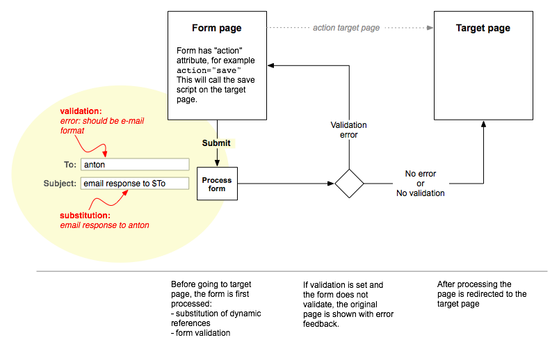
$To is substituted for the form element value with that name
FORMELEMENT:validate for usage instructions. %FORMSTATUS{}% to retrieve the status of the form; see FORMSTATUS.
action="upload"
topic and web, or use the more compact topic="Web.TopicName" format
method="POST"
validate="off" - form validation does not work with file upload
name="filepath"
%STARTFORM{
name="uploadform"
action="upload"
topic="%WEB%.%TOPIC%"
method="POST"
validate="off"
}%
%FORMELEMENT{
type="upload"
name="filepath"
title="Attach new file"
size="70"
}%
%FORMELEMENT{
type="submit"
buttonlabel="Upload file"
}%
%ENDFORM%
Optionally additional attachment parameters can be set with these fields:
%FORMELEMENT{
name="filecomment"
type="text"
title="Comment"
}%
%FORMELEMENT{
name="hidefile"
type="checkbox"
options="on=Do not show attachment in table"
}%
%FORMELEMENT{
name="createlink"
type="checkbox"
options="on=Create a link to the attached file"
}%
See the working example in FormPluginExamples:Upload
%<plugin>_<setting>%, i.e. %CACHECONTENTPLUGIN_SHORTDESCRIPTION%
data/debug.txt) | Class name | Note |
|---|---|
formPluginNotification |
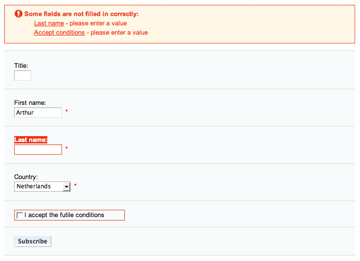
Used for validation error feedback |
fieldset.formPluginGroup |
To group checkboxes and radio buttons |
fieldset.formPluginGroupWithHint |
A group with an input hint - shows a border at the right |
formPluginTitle |
Element title |
formPluginError |
State that causes input fields to have a red border and titles to be bold red |
formPluginHint |
Input hint |
formPluginMandatory |
Mandatory indication (asterisk) |
FormPlugin.zip in your twiki installation directory. Content: | File: | Description: |
|---|---|
data/TWiki/FormPlugin.txt | Plugin topic |
data/Sandbox/FormPluginExamples.txt | Working examples |
lib/TWiki/Plugins/FormPlugin.pm | Plugin Perl module |
lib/TWiki/Plugins/FormPlugin/Validate.pm | Plugin Perl module for form validation |
pub/TWiki/FormPlugin/formplugin.css | Style Sheet |
pub/TWiki/FormPlugin/error.gif | Error icon |
| Plugin Author: | TWiki:Main.ArthurClemens |
| Other authors: | Validate.pm, originally CGI::Validate by Zenin <zenin@archive.rhps.org> aka Byron Brummer <byron@omix.com>. Copyright (c) 1997,1998 OMIX, Inc. All rights reserved. Use is granted under the same terms of Perl. |
| Plugin Version: | 08 Mar 2007 (V1.2) |
| Change History: | |
| 08 Mar 2008 | 1.2 Added condition, noformhtml and dateformat attributes. |
| 19 Oct 2007 | 1.1 Added date type. |
| 09 Jun 2007 | 1.0.5 Added upload parameter; option to turn off form validation; custom javascript has been replaced by code in pub/TWiki/TWikiJavascripts/twikiForm.js; added Flickr example. |
| 27 May 2007 | 1.0.4 Update javascript calls to new twikiForm.js. |
| 19 May 2007 | 1.0.3 Added element attributes: focus, disabled, readonly; Javascript parameters beforeclick, onFocus, onBlur, onMouseOver, onMouseOut, onSelect, onChange, onClick, onKeyUp; form parameter onSubmit. Fallback for form POSTs and TWiki versions earlier than 4.2: POST requests are converted to GET requests. |
| 15 May 2007 | 1.0.2 Added form attribute elementformat; changed parameter names for consistency: class to cssclass, elementformat to fieldformat. |
| 14 May 2007 | 1.0.1 Added missing lib. |
| 13 May 2007 | 1.0 First release. |
| TWiki Dependency: | TWiki 4.2; $TWiki::Plugins::VERSION 1.1 |
| CPAN Dependencies: | - |
| Other Dependencies: | - |
| Perl Version: | 5.005 |
| License: | GPL (GNU General Public License ) ) |
| Benchmarks |
GoodStyle nn%, FormattedSearch nn%, FormPlugin nn% |
| Plugin Home: | http://TWiki.org/cgi-bin/view/Plugins/FormPlugin |
| Feedback: | http://TWiki.org/cgi-bin/view/Plugins/FormPluginDev |
| Appraisal: | http://TWiki.org/cgi-bin/view/Plugins/FormPluginAppraisal |
| I | Attachment | Action | Size | Date | Who | Comment |
|---|---|---|---|---|---|---|
| |
error.gif | manage | 0.3 K | 2007-05-12 - 03:37 | UnknownUser | |
| |
form_on_submit_diagram.png | manage | 54.3 K | 2007-05-13 - 04:50 | UnknownUser | Form on submit diagram |
| |
formplugin.css | manage | 1.0 K | 2007-05-13 - 05:11 | UnknownUser | |
| |
screenshot_validation_example.png | manage | 23.1 K | 2007-05-15 - 05:11 | UnknownUser | Example of validation error feedback |
|
Copyright © 1999-2026 by the contributing authors. All material on this collaboration platform is the property of the contributing authors.
Ideas, requests, problems regarding Daya Bay? Send feedback Note: Please contribute updates to this topic on TWiki.org at TWiki:TWiki.FormPlugin. |